@SIPP
Brief
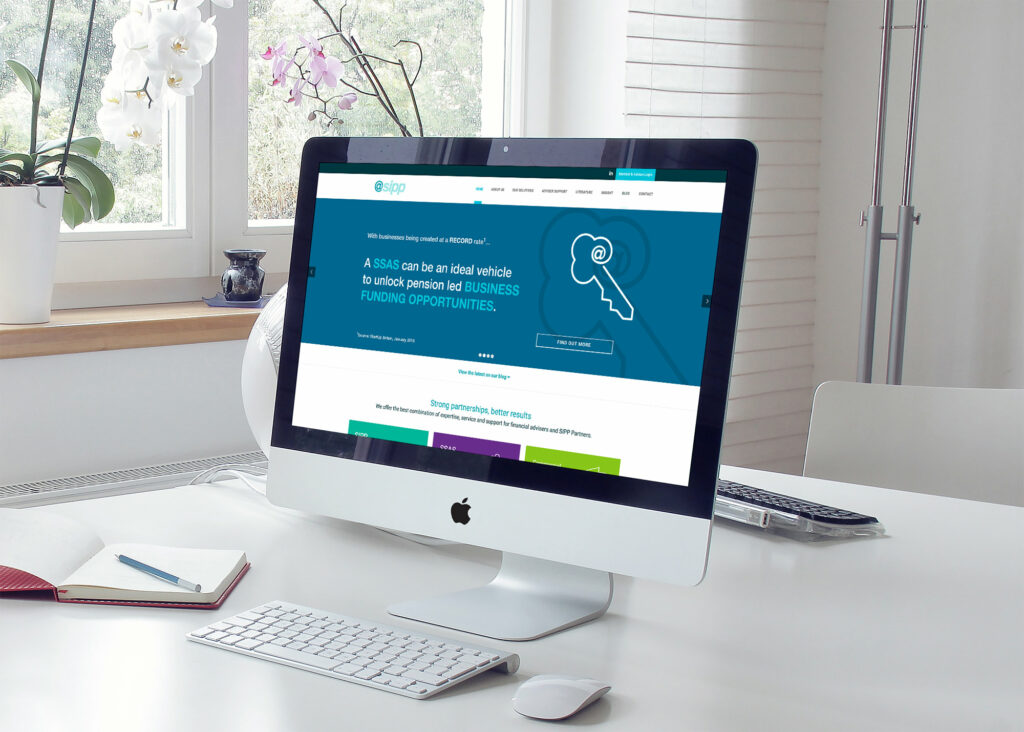
@SIPP is one of Scotland’s leading specialist providers of self-invested pension products.
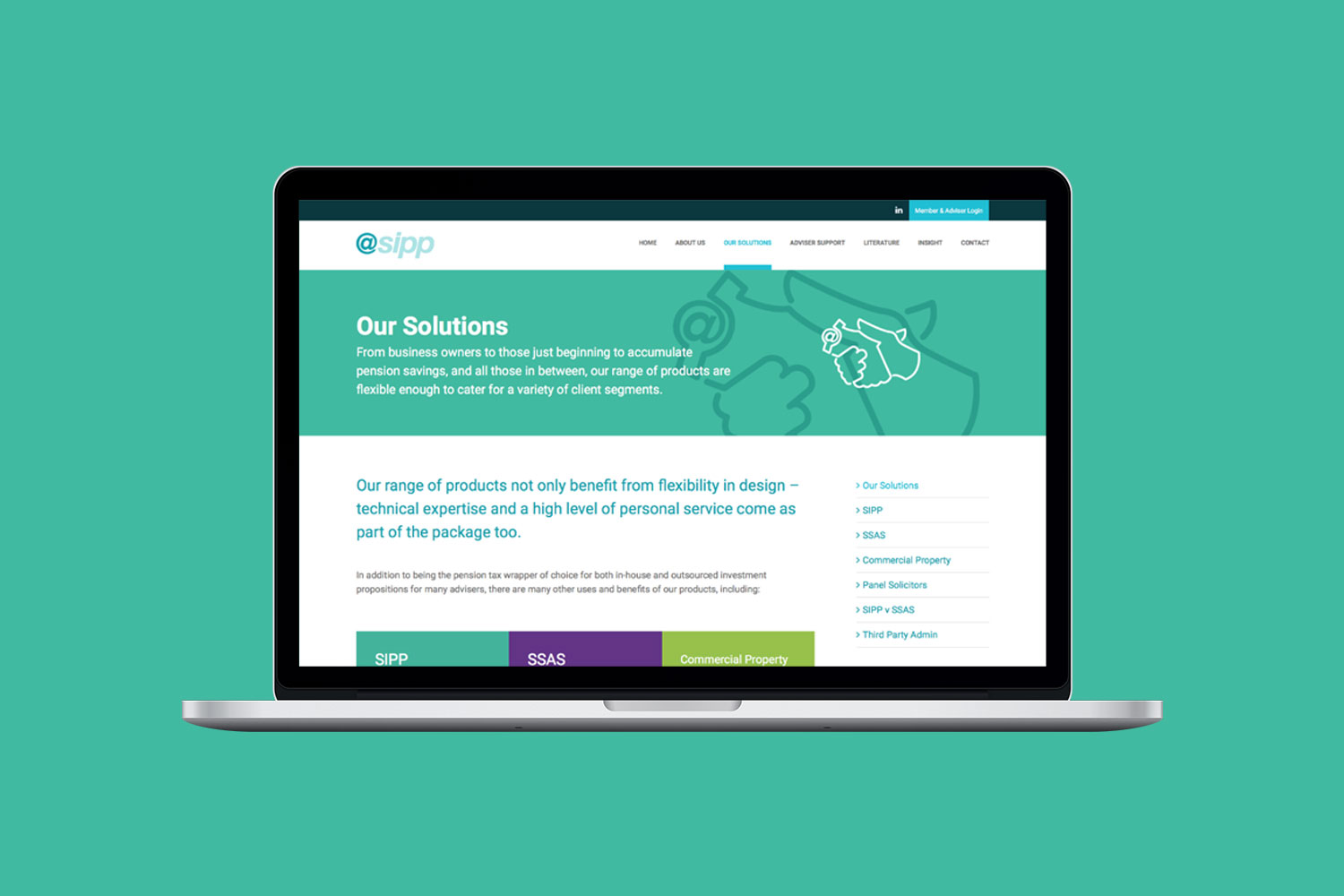
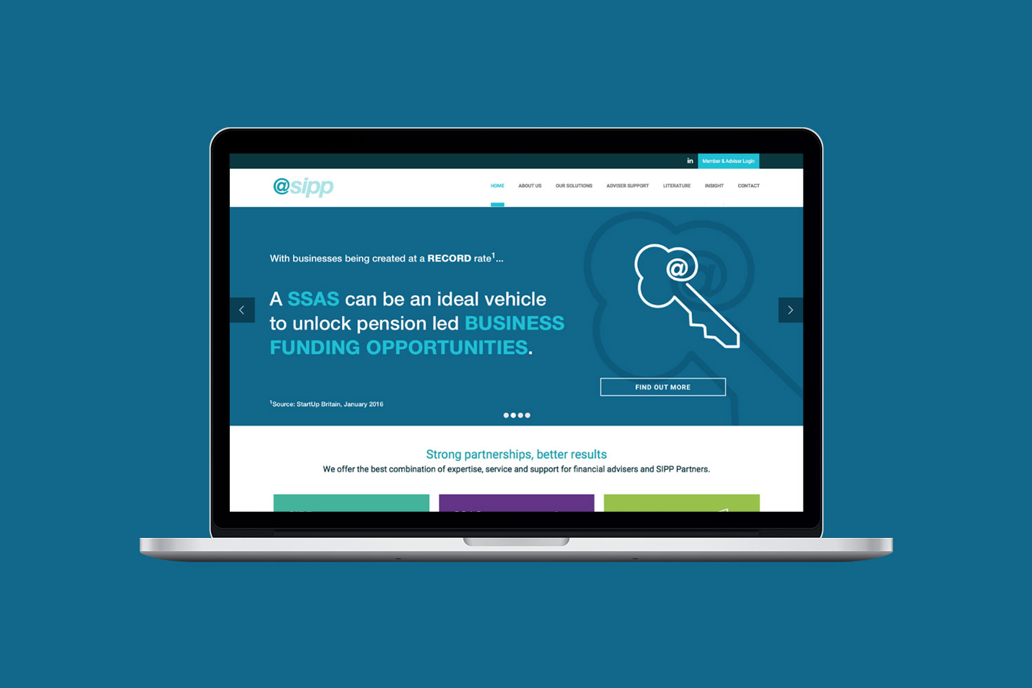
With an expansion in the product offering and a repositioning of the company in the marketplace, it was recognised that the identity no longer matched the proposition and messaging required. The rebrand was carried out in combination with the redevelopment of the company website.
Deliverables
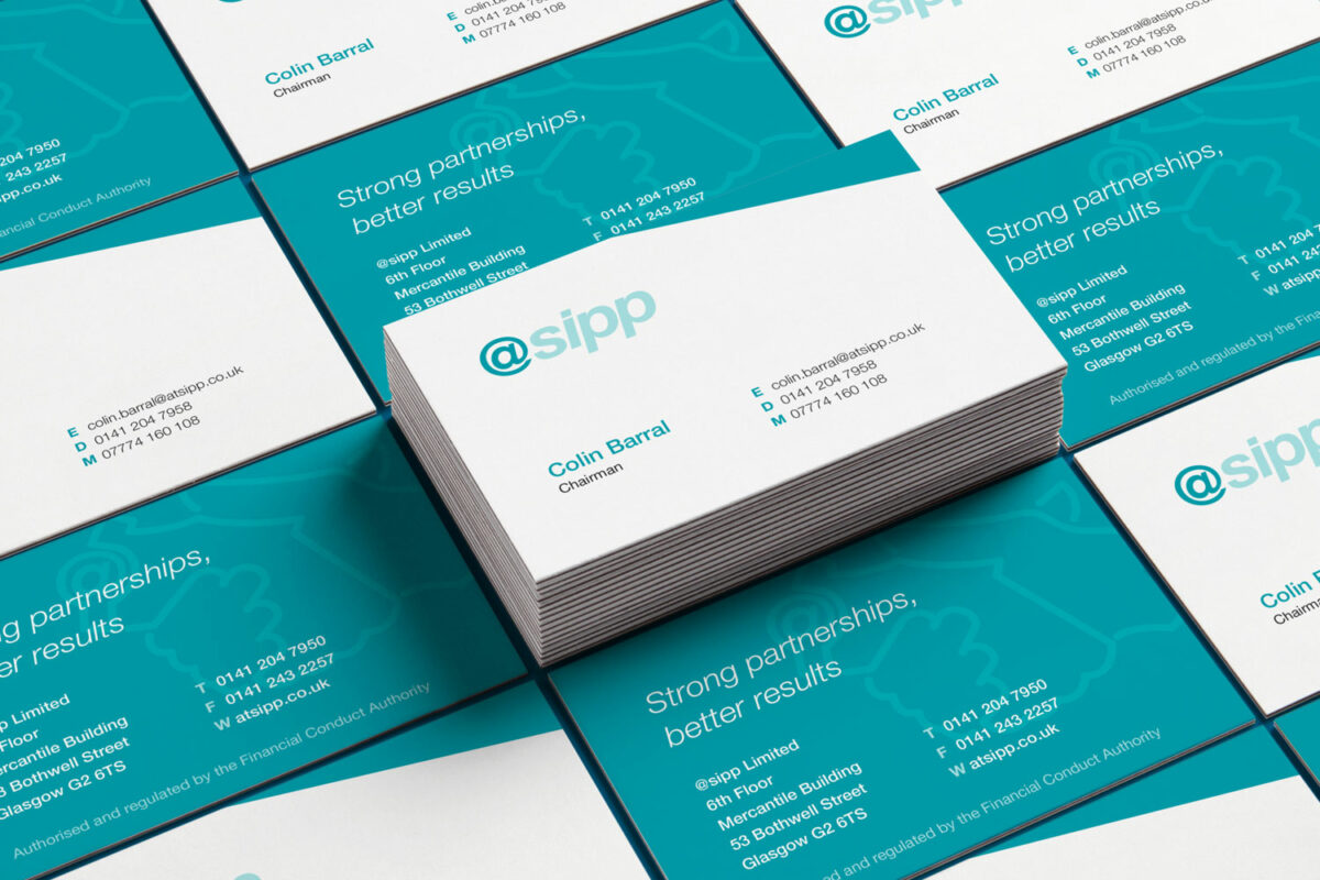
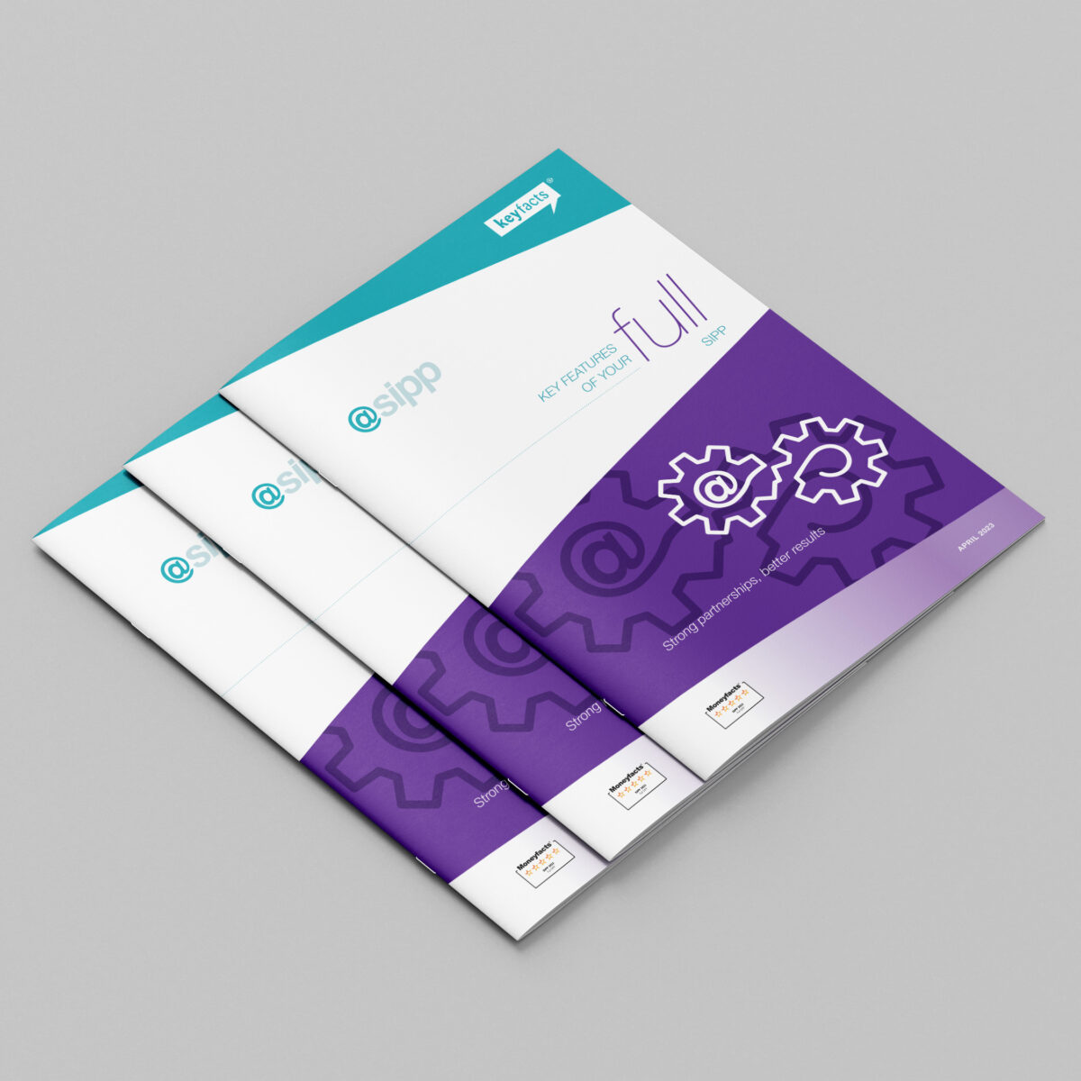
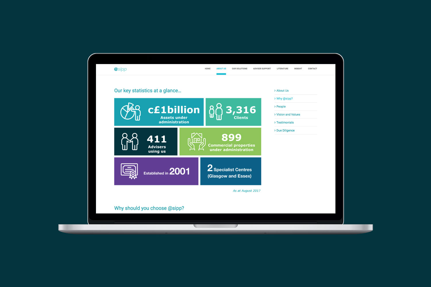
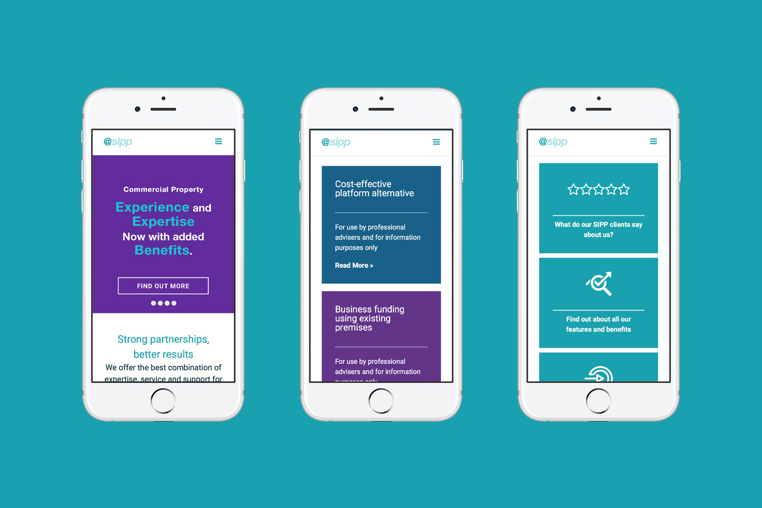
Although seen as a visual cliche, the brand has historically been anchored around an @ symbol and it remained a mandatory requirement that the new imagery should incorporate this. There wasn’t much scope to change the logotype, so based on a suite of key messages, we created a series of illustrations and infographics. The illustrative style, using a single line with the @ symbol incorporated into the image helped reinforce the core messaging. Each image, a visually compelling metaphor suggesting trust and growth, which are central brand values.
The new branding has since been implemented across all collateral, including website, forms, taxi advertising, office signage and promotional items.